.svg)
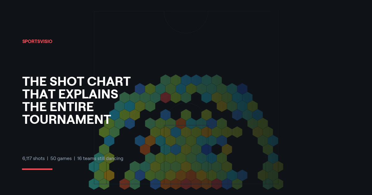
The Shot Chart That Explains the Entire NCAA Tournament
You don't need to watch 50 games to understand this tournament. You just need one chart.
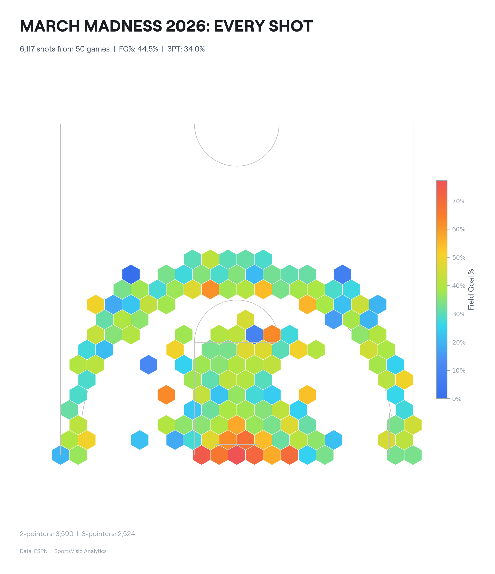
We pulled every shot from every game in the 2026 NCAA Tournament — 6,117 in total — and mapped them onto a single half-court. Each hex is colored by field goal percentage. Red means money. Blue means misery.
The picture that emerges is basketball in its purest form: get to the rim or shoot the three. Everything in between is a trap.
The Three Zones
The paint is where points are made. The hexes around the basket light up red and orange — the highest efficiency zone on the court. This is layups, putbacks, dunks, and floaters. Across 50 tournament games, shots within 8 feet of the rim convert at well above 50%. Every coach knows this. The data just confirms it in vivid color.
The mid-range is a wasteland. The space between the paint and the arc is filled with blue and green hexes. These are the 12-to-18-foot pullups, the contested elbow jumpers, the shots that feel open but aren't efficient. Tournament basketball, where possessions are precious and margins are razor-thin, punishes you for settling here.
The three-point line is a coin flip. Overall tournament three-point shooting sits at 34.0% — roughly one in three. But location matters. Corner threes show warmer colors than the wings. The top of the key is the coldest spot on the arc.
The overall field goal percentage across all 50 games? Just 44.5%. Tournament basketball is hard.
Every Team Has a Fingerprint
Shot charts get even more interesting when you break them down by team. We built hex snowflake signatures for every Sweet 16 team — showing where each program takes its shots relative to their total attempts. Darker hexes mean more volume from that zone.
The differences are stark.

Michigan is the most efficient team in the tournament at 61.2% FG. Their signature tells you why: 54% of their shots come from within 8 feet of the basket. They barely touch the mid-range (just 5% of attempts). When Michigan shoots, they score — because they've eliminated the bad shots entirely.
Purdue is shooting 57.9% from three. That number is absurd for any level. Their signature shows volume from the arc and — unusually — from the mid-range too (29% of attempts). Old-school shot selection, new-school results.
Alabama takes 57.8% of their shots from beyond the arc. Over half of every possession ends with a three-pointer. When they're hot, nobody in the country can keep up. When they're cold, that's how you get upset by a 13-seed.
St. John's has the lowest FG% of any Sweet 16 team at 41.3%. They're surviving on defense and volume, not efficiency. Over half their shots are threes at a mediocre 32.8% clip. They're one cold half from going home.
Duke is a tale of two teams. Elite inside at 63.9% on twos — but ice cold from three at 25.5%. Their signature shows heavy paint concentration with scattered arc attempts. If an opponent packs the paint and dares Duke to shoot, that's a vulnerability.
Arkansas is a paint bully. 56% of their shots come from within 8 feet. Only 26% are threes. They win the way your high school coach wanted you to play — get to the basket, finish, repeat.
What This Means for Coaches at Every Level
You don't need to be coaching in the Sweet 16 for shot charts to matter. The same patterns that separate Michigan from St. John's play out in every gym, at every level.
Know your identity. Michigan doesn't accidentally shoot 5% of their shots from mid-range. That's by design. They've built an offensive system that funnels possessions to the two most efficient zones: the rim and the arc. Does your team have that kind of clarity about where your shots should come from?
Find the mismatches. When a team's signature shows heavy paint reliance (like Arkansas), you know the game plan: wall up the lane and make them shoot from the outside. When a team lives on the arc (like Alabama), you know they need one hot quarter to run away with it. Shot charts turn scouting from guesswork into pattern recognition.
Track it over time. A single game's shot chart is a snapshot. A season's worth is a story. Are your players taking better shots in March than they were in November? Is your offensive system actually producing the looks you designed it for? The data doesn't lie.
This Used to Require a Stats Department
The charts in this post were built from ESPN play-by-play data — publicly available, but requiring serious data engineering to extract and visualize.
For college and pro programs, this kind of analysis is standard. For the other 99% of basketball? It's been out of reach.
That's what SportsVisio changes. Our AI generates shot charts, box scores, and per-player highlights automatically from any game footage. No special cameras. No stat crews. No manual entry. Just a phone or a camera pointed at the court.
The same kind of analysis you see the NCAA Tournament teams using? Your team can have it too.
Record the game. We do the rest. →
Related Stories

.png)

Book a Demo and Get a Free Trial
Set up time to speak with our team and see our product in action.